I’ll try to be as clear as I can: I want to see which of my current snaphots cause the total repo usage that I currently have.
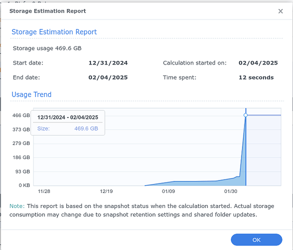
As I wrote in the stack exchange post about BTRFS that I linked to above, this is a usage graph from a Synology NAS that does it beautifully:
It starts with the first snapshot (ordered by time) and for each successive snapshot, it shows how much extra space is required to store it, relative to the first snapshot which is at y=0. (I might have started the y-axis at the size of the first snapshot myself, but that is a minor issue.)
If we imagine this was a graph of current restic snapshots, it would’ve shown that the snapshot for 12/31 introduces about 400GB of new data to the repo. It might actually have been introduced to a snapshot a little earlier and then “forgotten” in the meantime.
@MichaelEischer’s answer would not have told me this if the new data got introduced on 12/30 in a since-forgotten snapshot. The snapshot on 12/31 may not have grown the repo at all when it was made. But now it does represent growth, as the oldest snapshot currently to contain this new data.
To me this is a (“the”?) perfect visualization of space usage by my current snapshots.
Does anybody find any fault with it? Anything that could be improved? Any alternatives that are better?
